

Modern CSS has redefined web development with its powerful functionalities and extraordinary capabilities. CSS is a one-size-fits-all tool that offers standout options to make web pages highly interactive and enticing. Be it the flexibility in design, rapid customization, excellent styling options, or the advanced User Interface (UI) — CSS brings end-to-end solutions for all web development and styling needs. Above all, using CSS and HTML, you can add animation and effects by writing just a few lines of code, which is otherwise strenuous using JavaScript.
In this guide, we’ll walk you through the steps of creating a parallax scrolling effect with CSS in Chrome.
Prerequisites
To follow along with this tutorial, you must have a basic understanding of HTML and CSS.
Step 1: Create a New Project
Let’s start with creating a new project folder and files using the command-line interface. Open your terminal and type the following command to create a new project folder:
|
1 |
mkdir css-parallax |
Use the
cd command to change the directory to the
css-parallax folder:
|
1 |
cd css-parallax |
Next, create an HTML file in the
css-parallax folder where we’ll put all the HTML codes. Name the file
index.html and open it using the
nano command:
|
1 |
nano index.html |
Once we have our index.html file ready, let’s move forward and structure the webpage by adding the introductory HTML codes.
Step 2: Structure of the Basic HTML
In this step, we’ll design our web page by adding the
HTML codes. Add the following lines of code in the
index.html file:
|
1 2 3 4 5 6 7 8 9 |
<!DOCTYPE html> <html lang="en"> <head> <meta charset="UTF-8" /> <meta name="viewport" content="width=device-width, initial-scale=1.0" /> <title>Parallax Scrolling Effect with CSS</title> </head> <body></body> </html> |
After setting up the basic structure of our web pages, create three section classes – two for the background images and one for the static plain background. Next, add the following lines of code in the
<body> tag:
|
1 2 3 4 5 6 7 8 9 10 11 12 13 14 15 |
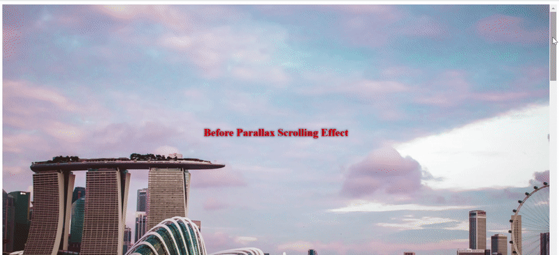
<body> ... <main class="wrapper"> <section class="section parallax bg1"> <h1>Before Parallax Scrolling Effect</h1> </section> <section class="section static"> <h1>Welcome to Parallax Scrolling</h1> </section> <section class="section parallax bg2"> <h1>After Parallax Scrolling Effect</h1> </section> </main> ... </body> |
Inserting the HTML codes in the <body> tag completes the basic setup of our html.file. In the upcoming steps, we’ll introduce CSS and define styling options for each.
Step 3: Introduction to CSS
Let’s style the website by adding the CSS file and creating the parallax effect. First, create a CSS file in the
css-parallax folder where we’ll put all the CSS codes required to create the parallax scrolling effect. After that, insert a
styles.css file in your
css-parallax folder using the
nano command:
|
1 |
nano styles.css |
We’ll style our webpage starting with the
.wrapper class. The
.wrapper class sets the perspective and scroll properties for the whole page. Start with the wrapper class and specify its height, overflow, and perspective. Set the height of the wrapper to a constant value for the parallax scrolling effect to work. In this guide, we have set the viewport value as using
100vh to get the full height of the screen’s viewport. You can modify the
vh value based on your project needs. Next, disable the screen horizontal scrollbar by setting the
overflow-x property as hidden. Also, specify the
perspective property value as
3px. Let’s add the following lines of code in the
styles.css file class:
|
1 2 3 4 5 6 |
.wrapper { height: 100vh; overflow-x: hidden; overflow-y: auto; perspective: 2px; } |
Step 4: Add Style for the .section Class
Next to the wrapper class, add styles to the .section class. The .section class defines the size, display, and text properties for the main sections. Set the position as relative to align a relative positioning of the child element .parallax::after and the parent element .section. Keep the view-height(vh) as 100 to get the full height of the screen’s viewport. Add, modify, and style the other parameters as per your needs.
Inside your
styles.css file add the following code next to the wrapper class:
|
1 2 3 4 5 6 7 8 9 10 11 12 13 14 15 16 |
.wrapper { height: 100vh; overflow-x: hidden; perspective: 3px; } .section { position: relative; height: 100vh; transform-style: preserve-3d; display: flex; align-items: center; justify-content: center; color: red; text-shadow: 0 0 5px #000; } |
Next, we’ll add a pseudo-element and style it to create the parallax effect and put it in action.
Step 5: Add Styles for the .parallax Class
In this step, we’ll add a pseudo-element on the .parallax. This pseudo-element will be the last child of the element and will add an ::after pseudo-element to the background image responsible for initiating the parallax effect. In the first half of the code, the basic display specification and positioning of the pseudo-element are set up. In the next half, we’ll add the transform property using the translateZ() CSS function and keep it as (-1px). Additionally, add a z-index to control the vertical stacking.
Add the following code below the
.section class:
|
1 2 3 4 5 6 7 8 9 10 11 12 13 14 15 16 17 18 19 20 21 22 23 24 25 |
... .section { position: relative; height: 100vh; transform-style: preserve-3d; display: flex; align-items: center; justify-content: center; color: white; text-shadow: 0 0 5px #000; } .parallax::after { content: " "; position: absolute; top: 0; right: 0; bottom: 0; left: 0; background-attachment: fixed; transform: translateZ(-1px) scale(2.0); background-size: 100%; z-index: -1; } ... |
Step 6: Add Images and Background for Each Section
Let’s add the final
CSS properties in the background images and background color of the static section. Start with adding a solid background color to the
.static section. Set the background color as
aqua and add the following code after the
.parallax::after class:
|
1 2 3 4 5 6 7 8 9 10 11 12 13 14 15 16 17 18 |
... .parallax::after { content: " "; position: absolute; top: 0; right: 0; bottom: 0; left: 0; background-attachment: fixed; transform: translateZ(-1px) scale(2.0); background-size: 100%; z-index: -1; } .static { background: aqua; } ... |
The .static class adds a background to the static section that does not have an image. The other two sections with the .parallax class have unique classes intended for holding background images. Add the URLs of the background images in .bg1 and .bg2 classes respectively.
In this tutorial, we’re using random images from Unsplash. You can also use images from other websites like Pixapay, Placekitten, and Pexels, to name a few, and customize them as you like. Add the following code to the
.static class:
|
1 2 3 4 5 6 7 8 9 10 |
... .static { background: aqua; } .bg1::after { background-image: url('https://images.unsplash.com/photo-1496543622559-12e927bdd81b'); } .bg2::after { background-image: url('https://images.unsplash.com/photo-1516422641841-cd9803ab02c6'); ... |
Step 7: Connect CSS with HTML
Now that we’ve added all the code for the parallax scrolling effect, let’s link the
styles.css file with the
index.html:
|
1 2 3 4 5 6 7 8 9 10 |
... <head> <meta charset="UTF-8" /> <^> <link rel="stylesheet" href="styles.css" /> <^> <meta name="viewport" content="width=device-width, initial-scale=1.0" /> <title>Parallax Scrolling Effect with CSS</title> </head> ... |
Open index.html we have created in Step 2 and in the Chrome browser:
Conclusion
In this tutorial, we went through the steps of setting up a functioning webpage using a basic setup. There are plenty of other interesting options and customization options you can experiment with. You can try adding shadow effects, modifying image scrolling, and other adjustments to make your learning fun and exciting.
To further dive into web development topics, check these resources from our blog:
- A Guide on Adding JavaScript to HTML
- Working with JavaScript: What are Objects
- What is jQuery and How can You Use It
Happy Computing!
- How to Deploy WordPress with Persistent Volume on Kubernetes Cluster - March 17, 2023
- Deploying Applications on Kubernetes Using Argo CD and GitOps - October 26, 2022
- Using Node.js Modules with npm and package.json: A Tutorial - October 6, 2022
- Using Ansible to Install and Configure WordPress with LAMP on Ubuntu - September 23, 2022
- Creating Views in the Django Web Application Framework - September 22, 2022